-
9th September 2011, 03:14 AM
#11
Star


Kinda looks like he just put a watercolor filter over the whole image and slapped green randomly on it.
-
9th September 2011, 02:46 PM
#12
"King of Quotes"

Rating: crap/10
Comments: At least it's not the same bull**** you see on every forum on the internet since 2001.
-
10th September 2011, 10:29 PM
#13
IAちゃんまじかわイア

-
10th September 2011, 10:55 PM
#14
Star
pretty neat, but the smudge kinda makes it a bit iffy, but it's still a very nice touch.
-
10th September 2011, 11:11 PM
#15
IAちゃんまじかわイア
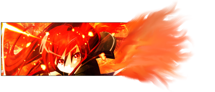
The smudge is the new thing I was trying. Without it, it's another of my average rectangular signatures. I shrunk it for my personal signature, though. Smaller is generally better, to an extent. I think it looks quite nice now.
-
10th September 2011, 11:17 PM
#16
Star
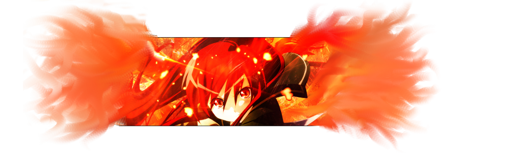
double sided smudge makes it look messy. one side smudge make it look better and much more improvised.
-
10th September 2011, 11:26 PM
#17
-
10th September 2011, 11:48 PM
#18
Star
oh that one looks very nice. I think the smudge only works well w/ lighter colors.
-
10th September 2011, 11:57 PM
#19
IAちゃんまじかわイア
Mm, that's true. I might try it again next time I decide to do something like that.
-
11th September 2011, 12:42 AM
#20
Star
try doing a smudge all around w/ no border. I think it'll look okay.
 Posting Permissions
- You may not post new threads
- You may not post replies
- You may not post attachments
- You may not edit your posts
-
Forum Rules


 Reply With Quote