


 Reply With Quote

A lot to comment on, eh? Well something for me to do during school lessons.
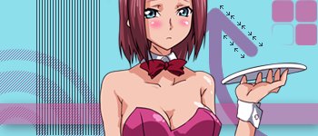
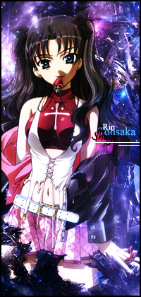
1. Barely blended render, and the background doesn't suit well either. Simple backgrounds generally fit better without renders.
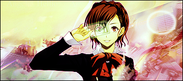
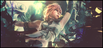
2. Nice flow with the background and the shape of the render. Top left is a bit plain, you could put some text there or something. Render's colour looks odd, but I don't know if it's meant to be like that or not.
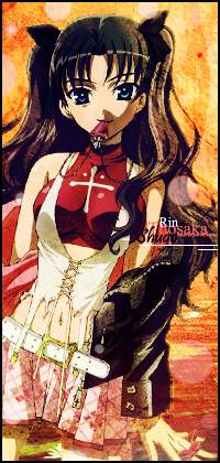
3. Simple and cloudy background, pretty nice looking but I don't like Naruto. It looks like you followed a very simple tutorial for it though, I see similar sigs everywhere.
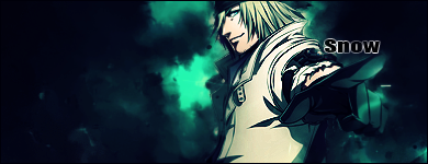
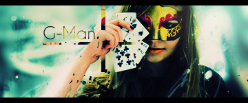
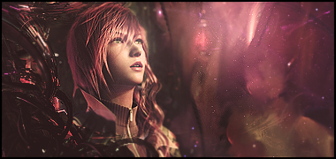
4. Pretty nice background, but I don't think real people look very good in sigs. Not much else to say about it, it's pretty good.
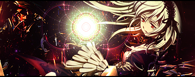
5. The fractal is too detailed, try lowering the opacity or changing the layer blending mode a bit. The background has too many sharp corners as well, but that can be fixed with a bit of blurring or smudging.
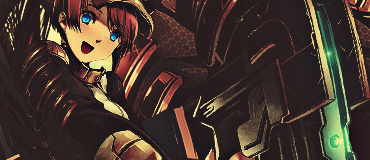
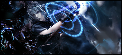
6. Mechanical-looking C4Ds don't really match the render, but the shiny blue thing on the guy's chest is pretty nice.
7. Very Grungey, and doesn't look quite right. A lot of noise around looks weird and misplaced.
8. Good background, render is fairly well blended, but the C4Ds are too sharp and noticable, drawing your attention to the wrong place.
*Class over, I'll finish up later.*